
Websites for holiday rentals and campsites: what guests look for
A guest is looking at your site on a phone, often with five other tabs open. The decision happens within seconds, and almost never on the basis of what you think matters most.
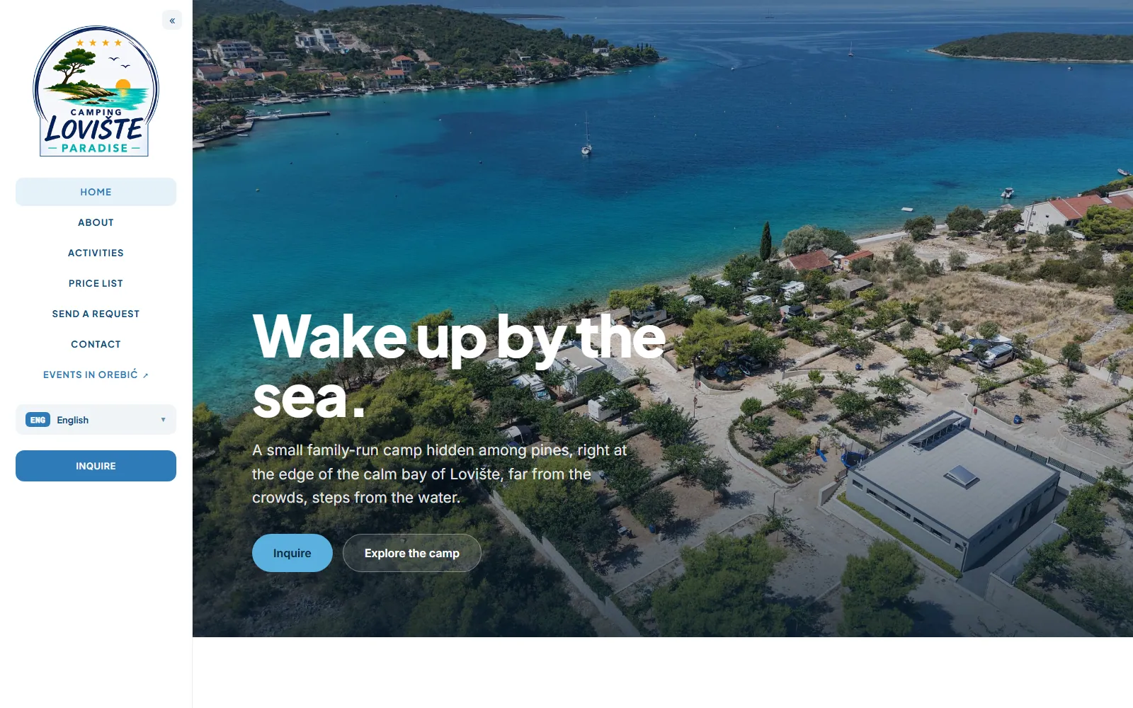
I have built sites for a campsite, private accommodation and a destination guide, mostly on the Pelješac peninsula. The pattern repeats every time: a lot of photography, an audience from abroad, and visitors who are still planning the trip. This is what those projects showed actually affects whether an enquiry arrives.
The first few seconds decide
A guest does not read, they scan. The first screen has to deliver three things: what the property is, where it is, and what the surroundings look like. If they have to scroll to work out whether they are looking at an apartment or a campsite, you have already lost them to the next open tab.
That makes the opening photograph the hardest-working element on the entire site. An aerial shot of the bay or a view from the terrace says more than three paragraphs of text, and it is one of the few places where paying for professional photography beats paying for extra functionality.
Photography is both the most important and the most demanding part
A tourism site sells an impression, and the impression is carried by photographs. At the same time, photographs are the main reason tourism sites take ten seconds to open. A gallery of thirty images straight from a camera is tens of megabytes, which is unusable on a mobile network in July.
The answer is not fewer photographs but smarter delivery. Images get prepared in several sizes, saved in a modern format, and loaded progressively as the guest scrolls. The gallery stays rich and the page opens immediately. This is a difference a guest will never notice but will absolutely feel.
The practical details guests want and rarely get
After the impression come the specifics, and this is where most sites fall down. How far the sea is, in walking minutes rather than as the crow flies. Whether there is shade. What the sanitary facilities are like. Whether there is parking. Whether pets are allowed. Whether the air conditioning works. How long the drive from the ferry takes.
Every one of those questions the site fails to answer becomes an email you have to write, or a guest who gave up rather than ask. The list of questions you actually receive in enquiries is the best possible blueprint for the structure of the site, and it is worth compiling before any design starts.
Languages by market, not by ambition
Guests come from specific countries and you already know which from your own bookings. If those are Germany, Poland and Austria, then German and Polish make sense, and Italian does not simply because it sounds good. Two well-written versions always beat five machine-translated ones, because a guest spots a bad sentence in their own language as fast as you would.
Technically, it matters that each language has its own URL. A version that exists only as a toggle on the same address effectively does not exist to a search engine, so a German guest searching in German will never reach it. This is one of the few technical decisions that directly affects the number of enquiries.
Platforms are not a substitute for your own site
The large platforms bring guests and that is real value. But they take a commission, they own the relationship with the guest, and they can change the rules whenever they like. Your own site does not replace the platform; it means the guest who found you there can book directly next time.
That does not require a booking system. For most smaller properties an enquiry form and a clearly visible contact work better, because the guest wants confirmation from the host before paying anyway. A full system with a calendar and availability only makes sense once the number of units or the volume of enquiries justifies it.
What every tourism site needs
- An opening photograph that explains in one second where you are and what the property is
- Answers to practical questions, including distance to the sea in walking minutes
- Contact details visible from every page, not only on a separate contact page
- Language versions on their own URLs, for the markets guests actually come from
- Galleries that load progressively, so the page opens on a mobile network too
The season is a deadline nobody moves
A tourism site has one deadline no other project has. A site published in mid-July has missed the window in which guests decide, and search engines need several weeks before they even begin showing it. So the build gets planned backwards from the date traffic actually starts, and the best time to do the work is winter, when there is room to gather photography and text.