
Five websites for businesses on Pelješac
Instead of general advice, five sites that are online today and the problem each one had to solve. All of them are for businesses on Pelješac.
Businesses on this peninsula share a few things: traffic is seasonal, guests are mostly foreign, and nearly all of them arrive on a phone, often on a connection that is not fast. Underneath that, though, the jobs are very different. Accommodation has to make an impression in seconds, a campsite has to answer thirty practical questions, and an estate agency has to let staff publish listings without a developer. This is a walk through five of them and what was actually hard in each.
Accommodation in Orebić: galleries against speed
For tourist accommodation the content is almost entirely visual. A guest wants to see the room, the view and the surroundings before reading a single sentence, so large galleries are unavoidable. They are also the single heaviest load on speed, and the traffic arrives on phones and from abroad, where every unnecessary second is felt directly.
The answer was not fewer photographs but different delivery: processing them at optimised sizes and deferring everything below the first screen. The structure walks the visitor through the accommodation, the facilities, the area and the contact details in order. WordPress was configured so the owner changes photographs and seasonal information without technical knowledge and without me.
A campsite at Lovište: thirty practical questions
A campsite is chosen visually, but the decision comes down to details. What the washblock is like, whether there is shade, how far the sea is, whether pets are allowed. That is a large volume of practical information that easily turns a site into a list, and the audience is mostly foreign and usually searching while still planning the trip.
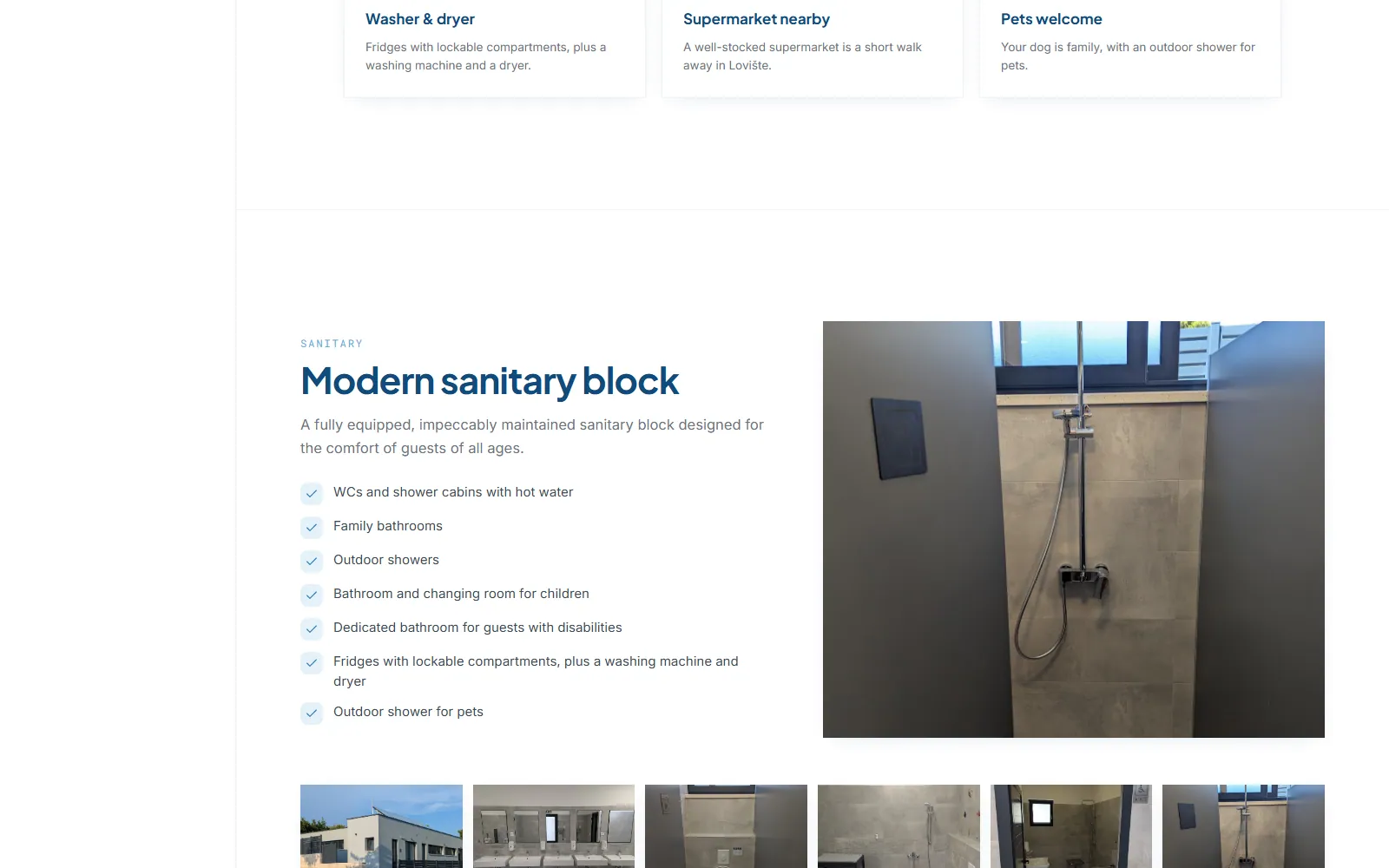
The site was built as a single-page application split into clear blocks: the feel of the location, the facilities, the washblock, activities nearby and distances to surrounding places. The content is multilingual, galleries load progressively, and every block ends with a clear route to the enquiry form, because a guest who has found their answer should not then have to hunt for how to ask.
A guide to the peninsula: content that grows
A destination guide has a fundamentally different problem from a presentation site. There is a lot of content and it has to stay findable, and visitors arrive with different intentions: beaches, wine, accommodation, activities. The structure has to survive growth without becoming unnavigable, which is a requirement you do not see at the start but two years into adding content.
So the content is organised into themed sections with consistent templates, which means every new page automatically gets the right heading structure and internal linking. Technical SEO was treated as part of the architecture rather than something added afterwards: semantic headings, descriptive addresses and optimised images. New destinations and topics get added with no development work.
Real estate: the listings change every week
With property the critical thing is that editing content does not depend on a developer, because the listings change constantly and nobody will wait for a new house to be published. At the same time property pages are image-heavy, which easily destroys loading speed, and speed and technical SEO are exactly what decide whether an individual listing gets found at all.
WordPress was set up with a content structure built for property and templates that hold a consistent layout regardless of who enters the data. On the technical side, the SEO groundwork: heading hierarchy, meta data, optimised images and a clean address scheme. The layout was developed with the mobile view first, because listings are usually browsed on a phone.
A design studio: the site must not upstage the work
A studio whose business is visual identity cannot have a generic site, but it also cannot have a site that draws attention to itself. It had to reconcile a rich visual presentation of the work with speed on mobile devices, where most of the visits come from, and a structure flexible enough to add new services without a redesign.
The application was built in React, with a component structure in which each service is a separate, reusable element. Images are served in modern formats, the layout was developed mobile-first, and the emphasis went on typography and white space so the studio’s work stays in front and the interface steps back.
What repeats across all five
- Most visits arrive on a phone, often on a connection that is not fast
- Photographs are both the most important content and the heaviest load
- The owner has to be able to change content without development work
- Guests want practical detail that most sites never give them
- Everything is published on its own domain, with access held by the client
The common denominator
None of those five projects was hard because of the technology. What was hard was working out precisely what the visitor was looking for, arranging the site around that, and then building it so the owner stays independent after handover. That is the same problem whether it is a campsite, an agency or a studio, and it is why the conversation always starts with what the site has to achieve rather than which technology you want.